

We all know it’s hard to focus on even one thing, so when we are designing an experience that needs to draw a visitor’s attention to different two places at once, we design very carefully.
And we test, test, test.
In the Paparoa Experience in Punakaiki, we created a 3D map table of the Paparoa National Park. We projected the land and ocean onto the table, with four smaller screens around the table, each showing their own story. As a visitor, you use a dial to scroll through one of four stories from the region. When you twist the dial, you control how fast you watch the story on both the map table, and your individual screen at the same time.
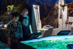
Visitors to the Paparoa Experience in Punakaiki
While we could have just had visitors press a button to watch the story, it’s more fun to control it. You can scroll forward and back, or even spin the dial really fast to speed through the story in seconds. Different visitors want different experiences and this is one way to cater to that.
A big challenge with the design was helping people realise their story was being told on both the individual screen and the map table. We knew we’d need to test with real users to make sure we were getting it right.
Off to testing!
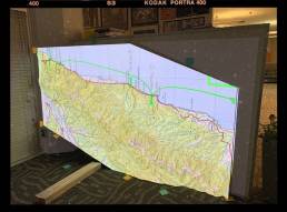
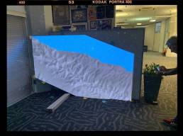
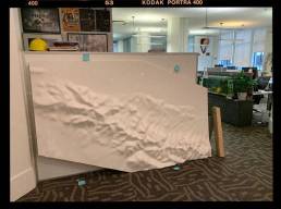
We set the 3D table up in our office to do user testing. We ended up leaning the table sideways in our office entry, bungee cording it to a bookshelf to hold it upright. The projector took over our lunch booth, sitting on the table that happened to be at just the right height.
And we test, test... and test!
These sorts of imperfect setups are normal and needed. But just because the setup isn’t perfect doesn’t mean it’s bad. We just need to understand how our setup changes how users react. In our case, we knew that we couldn’t test the real viewing angle, but we could test the connection between the screen, dial and table.
What did we learn?
Icons need to be simple, distinct, connected, and clear. For example, footprints work better than a tramper icon. Flashing circles (like a radar ping) draw attention to the icon’s arrival on screen and help guide the visitor.
This is just one of the ways we test to help us fine tune our designs.